Final Portfolio Paper
The first project was to create an interactive poster made so that a person could scan it using “scan life” and they would be taken to the website we had developed the poster for. I chose to make my poster over the make project “Iced Coffee Syrup” because I love coffee. My approach was to mix the two aspects of making the syrup; science and coffee. The reason this project was even put on the website was because the chemicals don’t move fast enough in cold coffee in order to melt the sugar you put in it. Therefore, this project was science and coffee mixed together. My two final ideas incorporated a coffee bean atom and a coffee periodic table. Because of the clean simplicity I picked the coffee periodic table for my final solution. All of the periodic elements were coffee related and the last one was the QR code for the viewer to scan. The final solution was mysterious but still alluded to the aspects of the project and I was very pleased with the way it came out.
The second project was a dual book cover that folded into a poster. At first I was extremely excited because I love books and I got to do one of my favorites; Henry’s Sisters by Cathy Lamb. As I progressed through this project I took a main theme. The book has to do with sisters who bake and have lots of problems. One of my ideas was to spill baking supplies and have words written in them. One example was flour spilled with “depression” written in it. The other idea was to make my book cover an over and as you unfolded it the oven would open and reveal a cupcake tin with molds that represented each character. This last idea is the one I finally chose. I decided to illustrate the whole thing and took reference from an old oven. With a few changes I made the oven into something that would work for my cover. Overall, the idea I think was successfull but the execution could have used some work. I plan to redo this project at some point before I put it in my portfolio. I’m not satisfied with the way it turned out really at all.
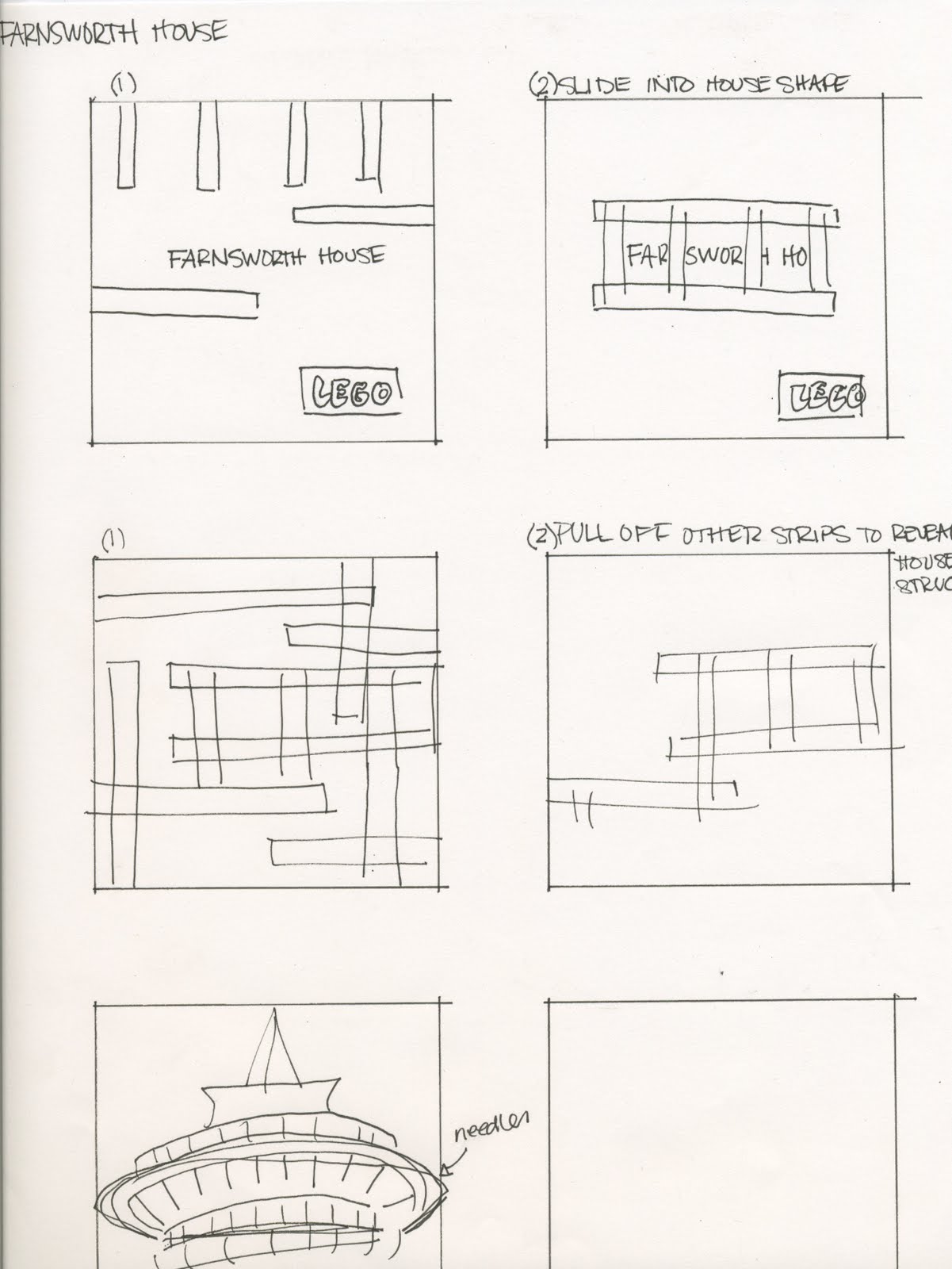
The last one was my favorite project I think I’ve ever done. The lego Architecture series really gave the class a lot of leverage and a lot of different ways to approach it. The interactivity of this project at first stumped me but once I found out a way to make mine interesting it was a fun thing to produce. I chose the Seattle Space Needle because I thought it was the most intersting looking structure out of them all. My interactivity consisted of the Space Needle popping right out of the middle of the poster when you opened it. The front was simple and just had an interesting fact about the architecture and it instructed you to open it. Then once you did, you were greeted by the Space Needle. The color scheme of the whole poster was very simple, with only black, white and red. With a few tweaks to the final product, it will turn out as a great piece for my portfolio. I’m very happy with the results and I’m sure I’ll be even happier once I fix the few loose ends.
I’m very glad I took this class. I think it really helped me. I was always afraid of designing posters because frankly I wasn’t any good at it. But this class boosted my confidence once I found out that I could turn out some quality work. This class was very beneficial for my self-esteem and also for my final portfolio. I’m sure these three projects will be a part of exit review which is a relief for me.